
Links
This page will be dedicated to my glowforge Plus: How To, Lessons Learned, Projects, etc. I’ll include what went well, and what didn’t. Learn by doing, right?
So what is a glowforge? It looks like a large printer, but instead of ink it uses an industrial-power laser to cut, etch, and/or engrave a variety of materials (wood, acrylic, metal, food, leather, ….). Unlike a 3D printer, the glowforge works by removing material rather than creating it. It’s incredibly precise, and often used to make wooden puzzles (which I hope to do later).
My YouTube channel includes a number of glowforge related videos. Below are specific projects as warranted. They should get more sophisticated over time! I’ll also make blog postings from time to time.

My glowforge Plus
This is a photo of my glowforge Plus, which I’ve placed in front of a window for easier venting. Venting is a requirement! The photos on the glowforge site make lite of this, but believe me, cutting through wood generates a lot of smoke. Acrylic and other materials can potentially generate nasty fumes. So ventilate!
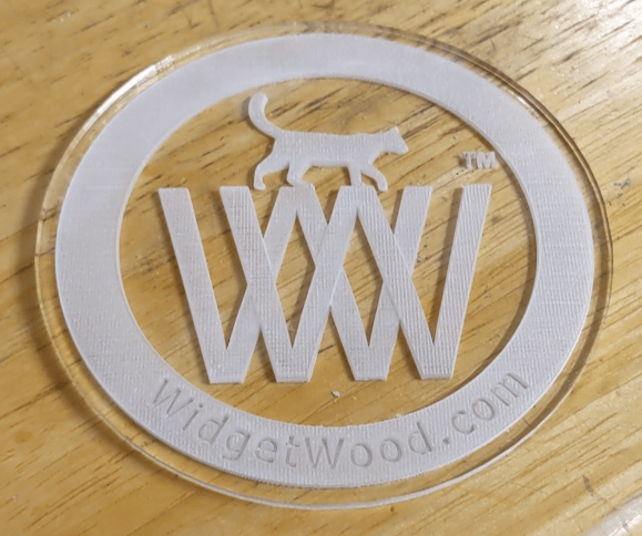
Acrylic Coaster
This is the second attempt at an acrylic coaster. The first included a filled band where the “widgetwood.com” text lives, and the result was a dark band and nearly impossible text. I modified the logo to remove the color band within the outer circle.
I also “printed” a mirror image of the logo. Which means it’s etched on the back, which kept the top surface nice and smooth.
How NOT to glowforge
Three strikes and I’m out! I made three huge rookie mistakes on this one (the dark, lower logo; the lighter was perfect once completed)
- I set the etch to “3D”, which removed (burnt) too much material since the logo uses dark lettering.
- My venting tube disconnected from the window panel (I didn’t notice that ’til after the etch).
- I left the project unattended.
Result: The basement filled with smoke and I wasted material.
Acrylic Logo, Attempt #1
I flipped my logo for my first acrylic attempt. Goal: smooth on the top, cut on the bottom.
Everything went well, but it’s too difficult to read “widgetwood.com” since that band is filled with color and it hides the writing. I’ll update the logo to remove that infill, and see if that helps to make the writing “pop”.
